7 min læsning

Dots don't just look great on Tour de France jersies - they are also great for conveying information in your visualizations in a simple way.
In the previous post, I created a simple graphic table as an example of how to visualize the overall standing in the Tour de France. I used a dot plot to display a set of values across categories - specifically, the times of the top 10 riders.
In today's post I will revisit the dot plot with two purposes. First, I want to touch upon the virtues of this type of chart by discussing why I chose to use the dot plot as opposed to another type of chart.
Secondly, since I created the chart in Excel, where the dot plot is not a standard chart, I thought I would share with you how to build a dot plot by customizing an XY Scatter plot.
As we saw in the last article, showing numbers in a table without any visual aids makes it way harder for the reader to assess the meaning. In the example, this was because all comparisons had to be done by the brain as no pattern was visualized. However, when we incorporated the right graphic representation of the data, actually showing the pattern, the story unfolded at a single glance. Scanning and mentally processing the table became a lot easier and insight was gained straight away.
The power of the dot plot
What made the dot plot the right choice? Not all charts would work well with message we were trying to get across, namely the spread of times within the leading group of riders. Take a bar chart for instance - as pictured below.

Normally, we would choose the bar chart for comparisons between individual values - in this case the times of the riders. But it looks rather odd, that the leading rider, whose time serves as the baseline (0), is suddenly missing. You could also argue, that the bars are a bit imposing in the overall visualization which becomes somewhat cluttered even though only 11 individual values are displayed in the bar chart.
We could plot the full time for every rider, but then it would be virtually impossible to see the differences in lengths between the bars. The differences in minutes and seconds would simply drown when the scale is done in hours. Chopping the axes, making them start at 42h 29' 24'' for instance, is not a valid option because the scale of a barchart must always start at 0.
The dot plot, on the other hand, does not share this limitation. We can start our scale anywhere we want, because it is no longer a length that we use to judge the value of the datapoints - it is now the 2D position. So it makes for a very intuitive and accurate data display, and one that preserves the visual lightness of the graphic table. After all, our purpose is showing the data points, not keeping the ink cartridge producers in business.
If you want to learn more about dot plots, Naomi Robbins has written some excellent articles:
How to make a dot plot - using Excel
On to the practical side of matters - how do you make a dot plot? A dot plot can be made by customizing Excel's XY Scatter plot.
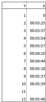
So let's fire up Excel and enter some data. For rider 1, enter 0, and then input the times of riders number 2 - 12. I.e. enter '00:03:25' for rider 2 and likewise for the following riders.
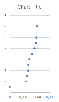
Next, select the data and insert a XY Scatter plot. It will look something like this:
We need to reverse the order of the values, so select the Y-axis and press Ctrl+1 to access the format dialog. Now, check 'Values in reverse order'.
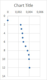
As you can see, Excel is a little too generous with the Y axis scale which ends at 14. We only have 12 values to display, so while we are at it, we will change the axis minimum to 0.5 and the maximum to 12.5. Why 0.5 and 12.5? This is because we want to be able to easily align the chart with the 12 rows of our table. We will align the two in a moment - but please stay with me a little longer while we perform a similar operation on the X axis. On the X axis, set the minimum to -0.0005 and the maximum to 0.0045 to make better use of the plot area and avoid that the 0 value ends up sitting on the border. (The numbers on the X axis result correspond to the Excel serial number of the time).

OK, it is now time to clean up the chart, getting rid of all the superflous stuff that doesn't really add value to the communication of data. So go ahead and delete/remove the following items:
- Chart Title
- Gridlines
- Axis labels
- Axis lines
- Chart Area Fill Color
- Plot Area Fill Color
- Chart Area Border
- Plot Area Border
Finally, we will change the color of the dots - the color does not signify anything, so we just pick a neutral one.
The result would be something like this. Note that I have placed the chart in the table; the transparency of the chart makes it possible to see the row lines of the table.
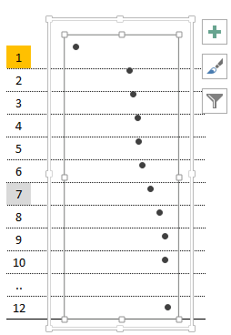
We now need to align the table and the chart. First, resize the plot area of the chart (small rectangle in the picture) so it fits the entire chart area. Next, resize the chart area (large rectangle in the picture) to align it with the table - each dot should be centered in its own row. Tip: Pressing the Alt key while resizing the chart (or other objects) makes it snap to the underlying cell grid - easy as can be!
And that's it - the dot plot is ready to use with the table.
Any questions?
Please reach out to info@inspari.dk or +45 70 24 56 55 if you have any questions. We are looking forward to hearing from you.
Please reach out to info@inspari.dk or +45 70 24 56 55 if you have any questions. We are looking forward to hearing from you.
Relaterede Posts
Special characters in SSAS Name properties
Have you ever got the request to use special characters, like ( ) / & %, in the names of your...
Using table variables in a SSIS data source
Every now and then standard queries just aren’t sufficient as data sources and therefore it might...
QlikView – how many records can you have in a document?
Triggered by a discussion last week, I just had to test how many records that could be stored in...